feColorMatrix使用技巧(译)
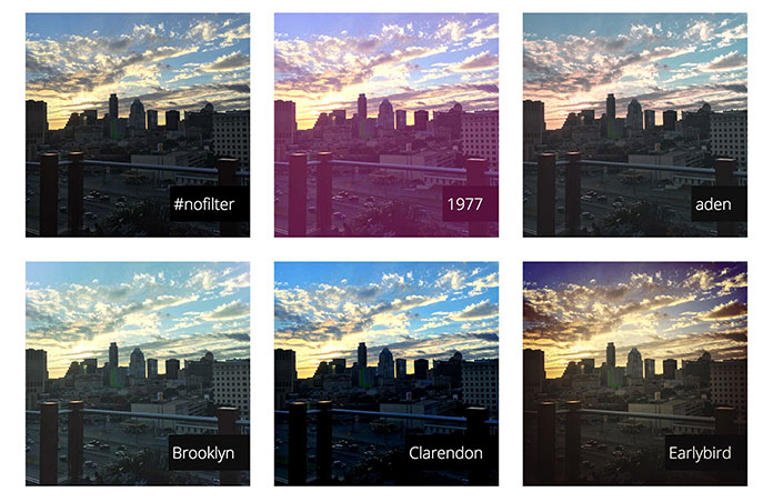
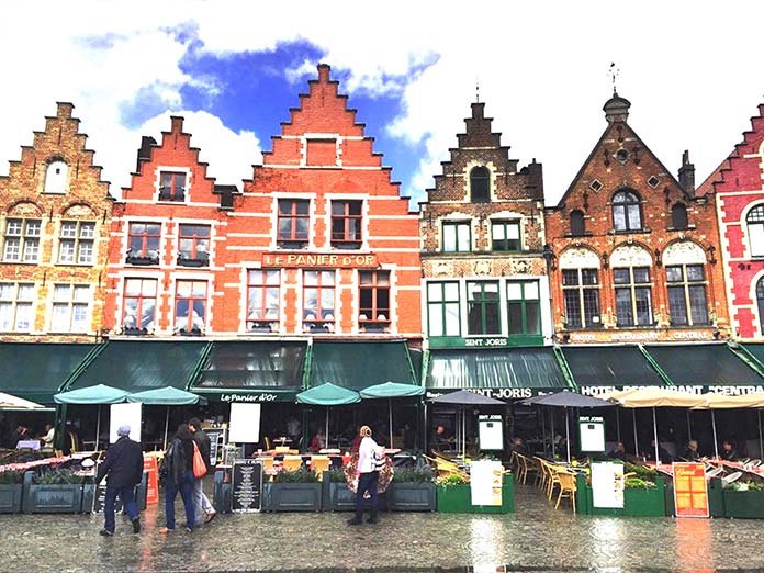
你们见过 Spotify 的年终活动吗?他们通过图像颜色处理创造了引人注目的视觉美感。

善用图形处理可以增加我们网页的逼格——过滤器filter就能通过动态串联的方式帮我们在浏览器做到这一点。
CSS 与 SVG
今年早些时候,我推出了CSSgram,这是一个纯 CSS 库,它使用过滤器和混合模式来创建图片过滤器。
现在,这可以通过修补和混合模式来完成——但CSS过滤器有一个巨大的缺点:它无法控制RGBA通道。但是SVG的feColorMatrix弥补了这个不足。
SVG filters
在SVG中,fe-前缀表示滤镜相关属性。它们可以产生各种各样的颜色效果,比如模糊,比如生成3D纹理。
SVG 过滤器兼容性: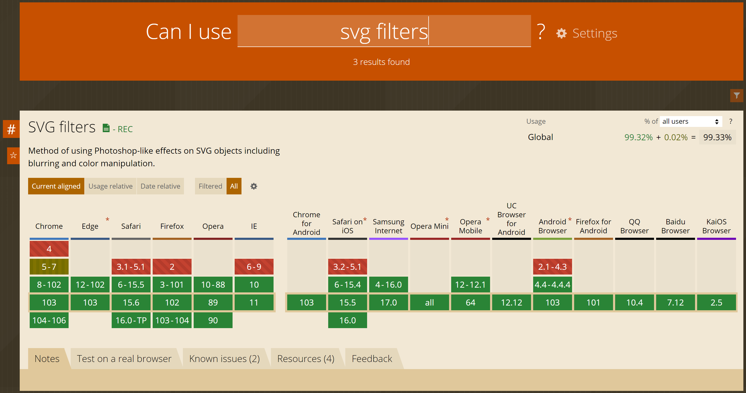
可以看到如果你不需要支持IE9以下版本,那么就可以放心地使用svg过滤器了。
使用SVG过滤器
这是SVG过滤器的基本结构:
1 | <svg> |
在 SVG 中,您可以在defs中声明一个过滤器。并可以像这样在 CSS 中引用:
1 | .filter-me { |
url里面是过滤器的路径,所以filter: url('../img/filter.svg#filterName')和filter: url('http://una.im/filters.svg#filterName')两种写法也都是可以的。
feColorMatrix
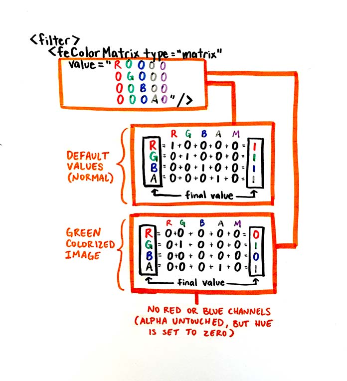
feColorMatrix是色彩处理最核心的属性,它可以基于矩阵对通道 (RGBA)处理从而影响色值。类似 Photoshop 中的通道编辑功能。
这是的feColorMatrix写法,在原始图像中每个 RGBA 值默认是1:
1 |
|
最后一个数字1是用来做通道值的piany。最终的 RGBA 值可以像列一样从上到下读取:
1 | /* R G B A 1 */ |
下图可以更直观的看出颜色矩阵和颜色向量是如何相乘的
RGB值
着色
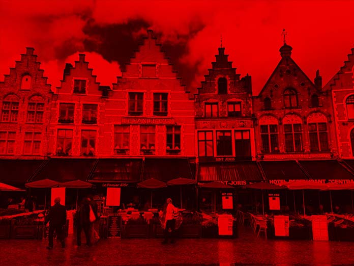
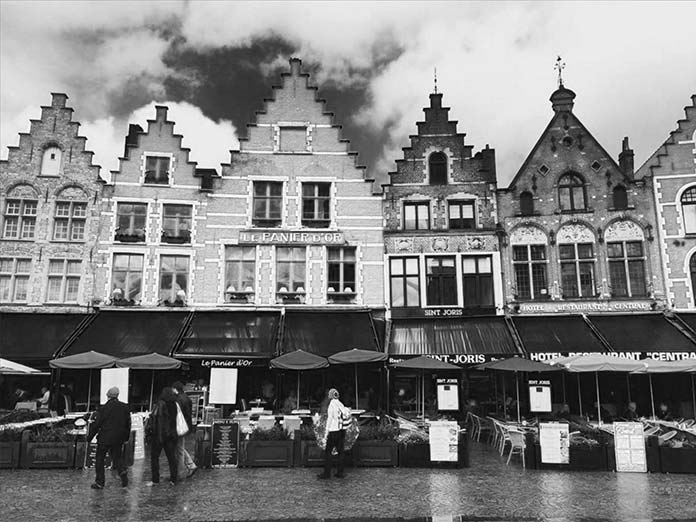
可以通过像下面这样删除通道来修改图片颜色:
1 | <!-- 移除 B 和 G 通道 (只保留R) --> |
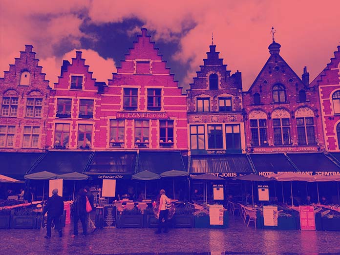
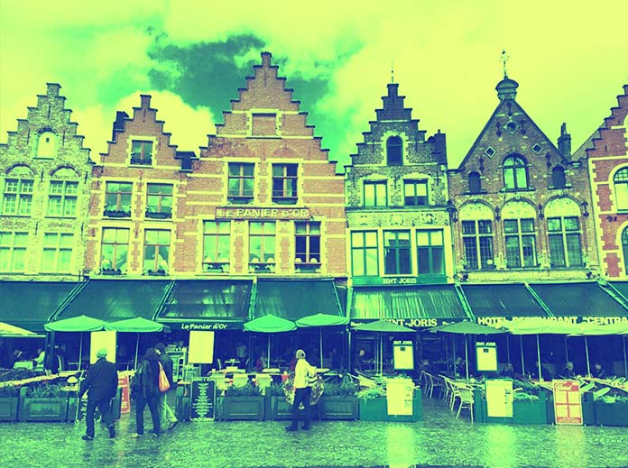
这就是图像添加上面“green”这个滤镜后的样子: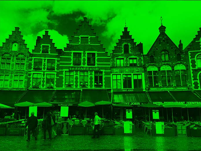
通道混合
也可以通过混合不同的通道获得其他颜色的滤镜:
1 | <!-- 移除B通道(混合R和G通道) 红色 + 绿色 = 黄色 --> |
前面的示例中是在 CMYK 模式下混合颜色,因此删除红色通道意味着保留绿色和蓝色通道。当绿、蓝混合会产生青色,红、蓝混合产生紫色。
Justin McDowell写过一篇文章《Mixing Color for the Web》,解释了 HSL(色相、饱和度、亮度)颜色理论。对 SVG来说,需要记住 亮度值就是明度。在这里,每个通道中都保留了每个亮度级别,因此对于紫色,我们得到的图像如下:
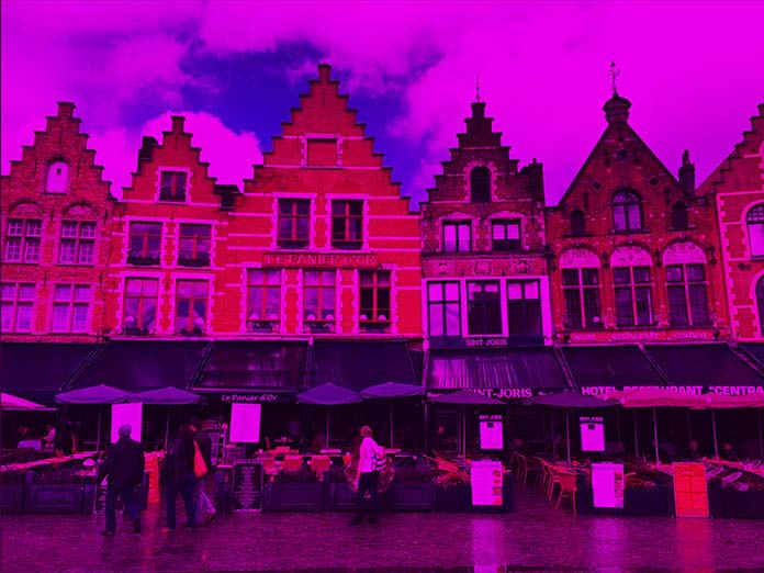
为什么云中有这么多紫色和亮度?思考下这张 RGB 图表:
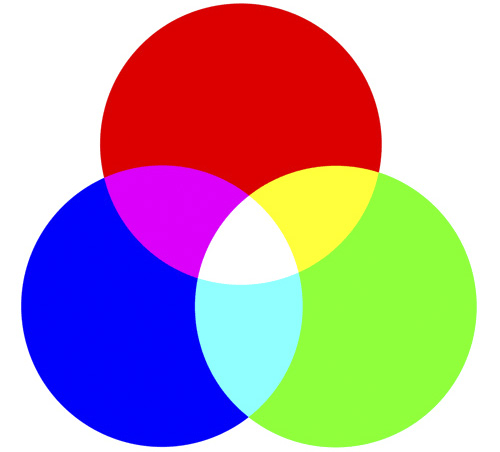
当一个值缺失会被另外两个值替代。所以现在,没有绿色通道,就没有白色、青色或黄色。然而,这些颜色实际上并没有消失,因为它们的亮度(或 alpha)值还未被触及。我们接下来试试操作这些 Alpha 通道时会发生什么。
ALPHA值
我们可以通过 Alpha 通道(第四列)处理阴影和高光色调。第四行影响整个 Alpha 通道,同时也影响每个通道的亮度。
1 | <!-- 看起来是一个透明度改为0.5的滤镜 --> |
In the following example, we’re reusing the matrix from the magenta example and adding a 100% alpha channel on the blue level. We retain the red values, yet override any red in the shadows so the shadow colors all become blue, while the lightest values that have red in them become a mix of blue and red (magenta).
在下面的示例中,我们重用了洋红色示例中的矩阵,并在蓝色级别上添加了 100% 的 Alpha 通道。我们保留红色值,但是覆盖了阴影中的红色,因此阴影颜色全部变为蓝色,而其中包含红色的最亮值变为蓝色和红色(洋红色)的混合。
1 | <filter id="blue-shadow-magenta-highlight"> |
如果最后一个值小于 0(最多 -1),则会发生相反的情况。阴影会变成红色而不是蓝色。在 -1 时,这些会产生相同的效果:
1 | <filter id="red-overlay"> |
然而,将这个值设为 0.5 而不是 -1,可以让我们看到阴影中的颜色混合:
1 | <filter id="blue-magenta-2"> |
移出通道
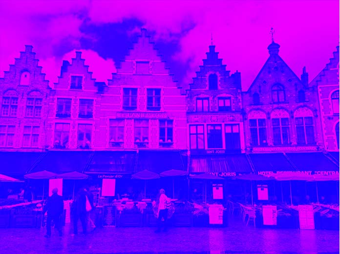
我们可以通过第四行影响单个通道的整体 alpha。由于我们的示例有蓝天,我们可以通过将蓝色值转换为白色来消除天空和蓝色值,如下所示:
1 | <filter id="elim-blue"> |
以下是更多通道混合的示例:
1 | <!-- No G channel, Red is at 100% on the G Channel, so the G channel looks Red (luminosity of G channel lost) --> |
变亮和变暗
您可以通过将每个通道的 RGB 值设置为小于 1 的值(这是完整的自然强度)来创建变暗效果。要变亮,请将值增加到大于 1。您可以将其视为扩大或减少前面显示的 RGB 色环。圆的半径越宽,创建的色调越亮,“吹散”的白色就越多。当半径减小时会发生相反的情况。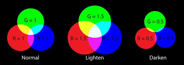
这是对应的矩阵:
1 | <filter id="darken"> |
1 | <filter id="lighten"> |
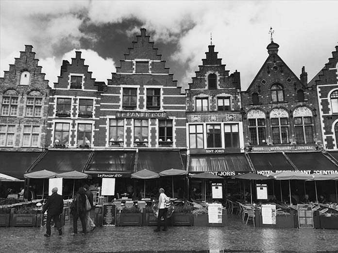
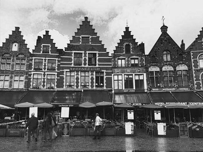
灰度
您可以通过在列中仅接受一个阴影的像素值来创建灰度效果。但是,根据应用的活动级别,存在不同的灰度效果。在这里,我们正在进行通道操作,因为我们正在对图像进行灰度化。考虑这些例子:
1 | <filter id="gray-on-light"> |
1 | <filter id="gray-on-mid"> |
1 | <filter id="gray-on-dark"> |
将它们拉在一起
真正的力量feColorMatrix在于它能够混合通道并将许多这些概念组合成新的图像效果。你能读懂这个过滤器发生了什么吗?
1 | <filter id="peachy"> |
我们在其正常的 Alpha 通道上使用红色通道,以一半强度应用绿色,并在较暗的 Alpha 通道上应用蓝色,但不在其原始颜色位置。该效果在阴影中为我们提供了深蓝色,并为高光和中间色调提供了红色和半绿色的混合。如果我们回忆一下 red + green = yellow,red + (green/2) 会更像珊瑚色:
这是另一个例子:
1 | <filter id="lime"> |
在那个片段中,我们使用了正常的红色像素色调、过度的绿色和没有原始色调像素的蓝色,但应用在阴影中。再次,我们在阴影中看到深蓝色,并且由于红色 + 绿色 = 黄色,红色 + (green*2) 在高光中将更像是黄绿色:
通过玩这些价值观可以探索很多东西。这种探索的一个很好的例子是Rachel Nabors的Dev Tools Challenger,她从海里的鱼中过滤掉了较长的波长(即红色和橙色通道),解释了为什么“Orange Roughy”实际上在水中看起来是黑色的。(注意:需要 Firefox。)
挺酷的!科学!和彩色滤光片!现在您对情况有了基本的了解,您也拥有创建自己的效果所需的工具。
对于一些非常受欢迎的 Spotify 双色调效果,我建议您查看Amelia Bellamy-Royds的一篇文章,他更详细地介绍了. Sara Soueidan还写了一篇关于图像效果的出色文章,其中她使用 SVG 重新创建了 CSS 混合模式。feColorMatrix
滤镜效果参考
一旦您了解了feColorMatrix. fe-以下是目前所有 * 选项的便捷指南,供您进一步探索:
feBlend:类似于CSS 混合模式,此功能描述图像如何通过混合模式进行交互feComponentTransfer: 改变单个 RGBA 通道的函数的总称(即 ,feFuncG)feComposite:定义像素级图像交互的过滤器原语feConvolveMatrix:此过滤器决定像素如何与其近邻交互(即模糊或锐化)feDiffuseLighting: 定义一个光源feDisplacementMap``in:使用另一个输入 ( ) 的像素值置换图像 (in2)feFlood: 使用指定的颜色和 alpha 级别完成过滤器子区域的填充feGaussianBlur:使用输入标准偏差模糊输入像素feImage: 用于其他过滤器(如feBlend或feComposite)feMerge:允许异步应用滤镜效果,而不是分层feMorphology:侵蚀或扩大源图形的线条(想想文本上的笔画)feOffset:用于创建阴影feSpecularLighting:作为凹凸贴图的 alpha 分量的来源,也就是Phong 反射模型的“镜面反射”部分feTile:指的是如何重复图像以填充空间feTurbulence:允许使用Perlin Noise创建合成纹理